Capps Truck & Van Rental
Brand Identity & Trade Show Display System
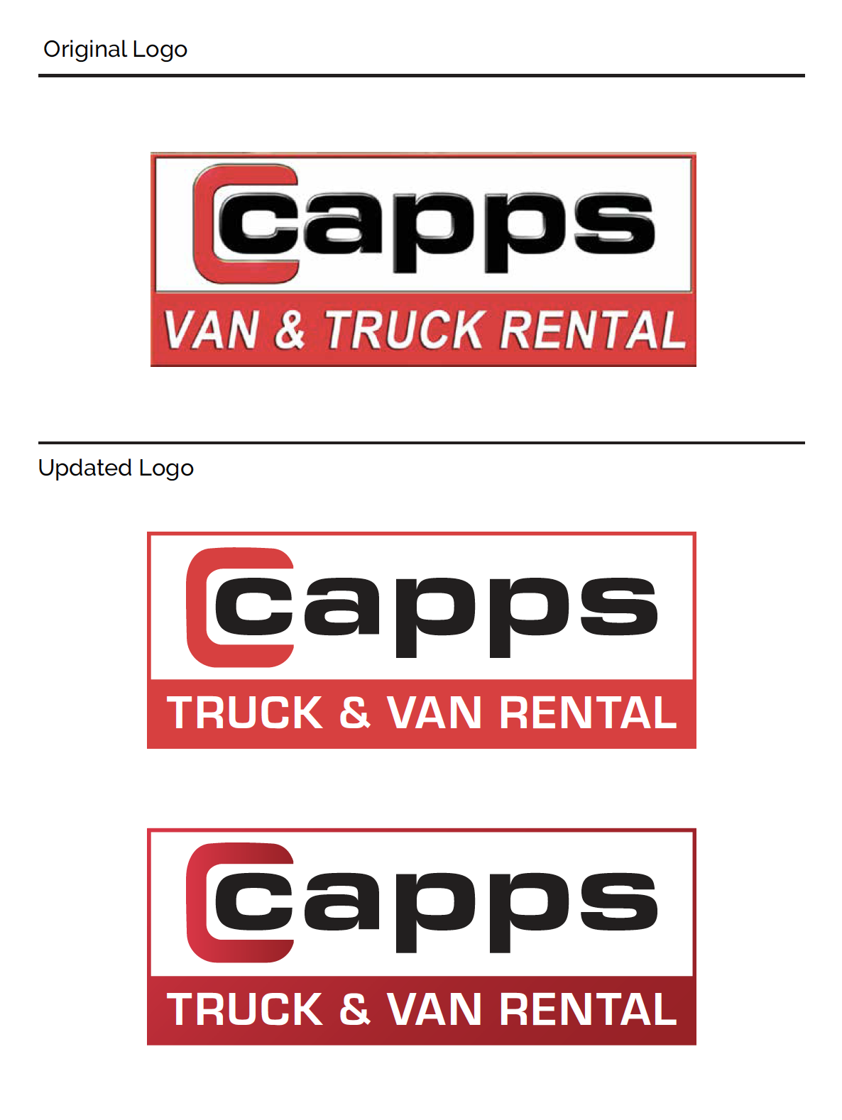
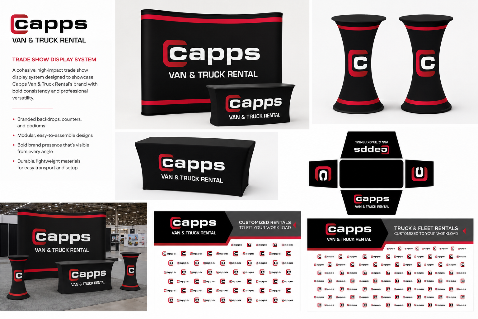
A rebrand and trade show display system designed to give Capps Truck & Van Rental a bold, consistent presence - both on their materials and on the show floor. The project centered on a refreshed logo built around a strong "C" mark, then extended across a full trade show display system for maximum visibility at events.
Deliverables included:
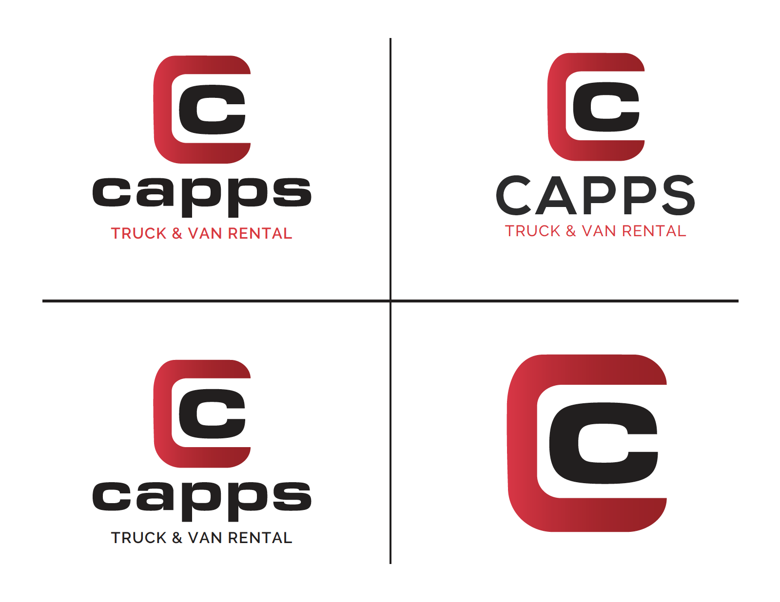
Logo & brand identity - a refreshed logo system with multiple lockup variations for different applications and formats
Trade show display system - a cohesive booth setup including a branded pop-up backdrop, counter, and podium
Modular, easy-to-assemble design - built for durability and quick setup/teardown at events
Branded collateral - table throws, header/side panels, and repeating pattern graphics that reinforced the logo across every surface
The result was a bold brand presence that stayed visible from every angle of the booth, giving Capps a professional, unified look that scaled easily from trade show floor to printed materials.
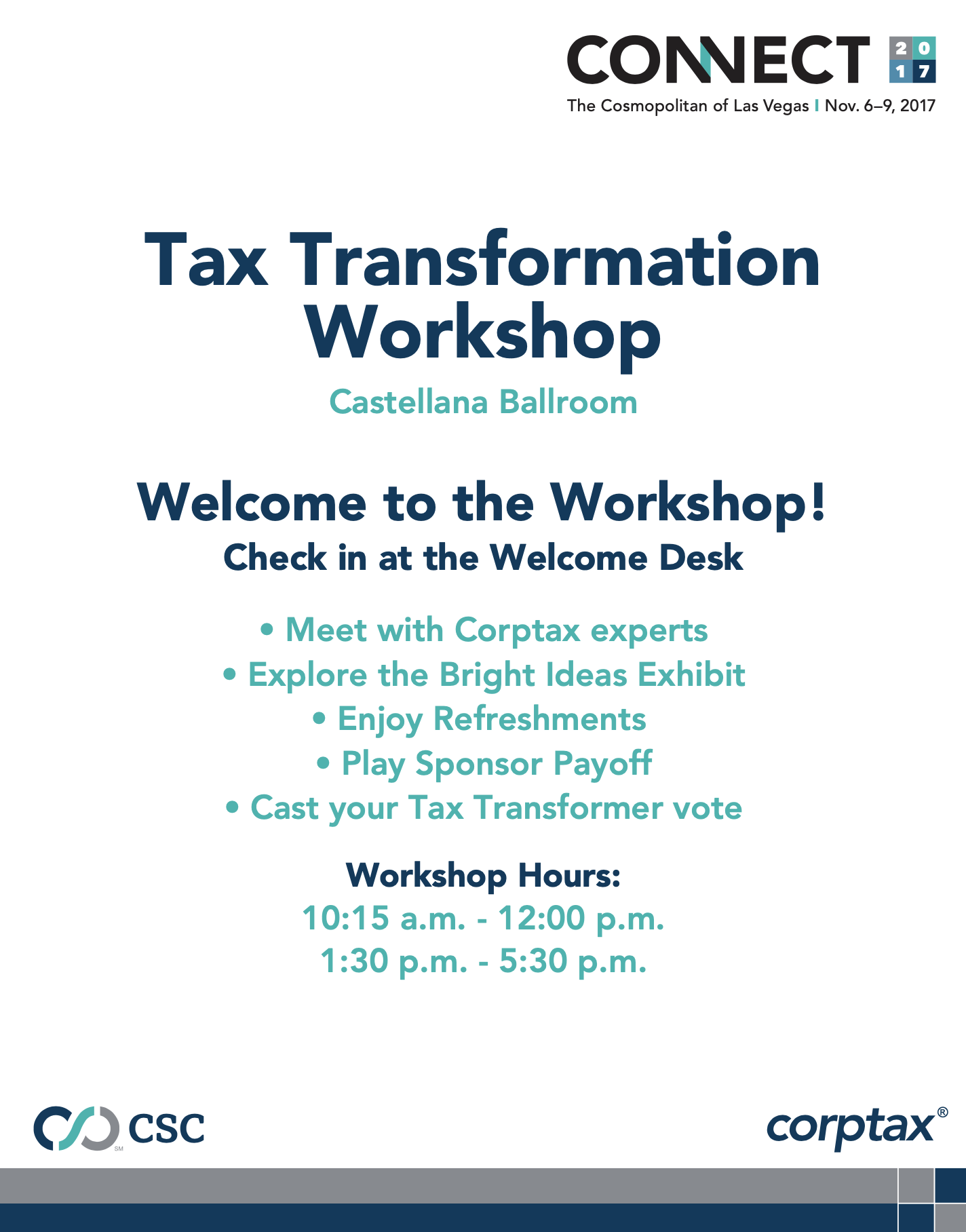
CSC Corptax Connect 2018
Environmental Branding & Event Experience
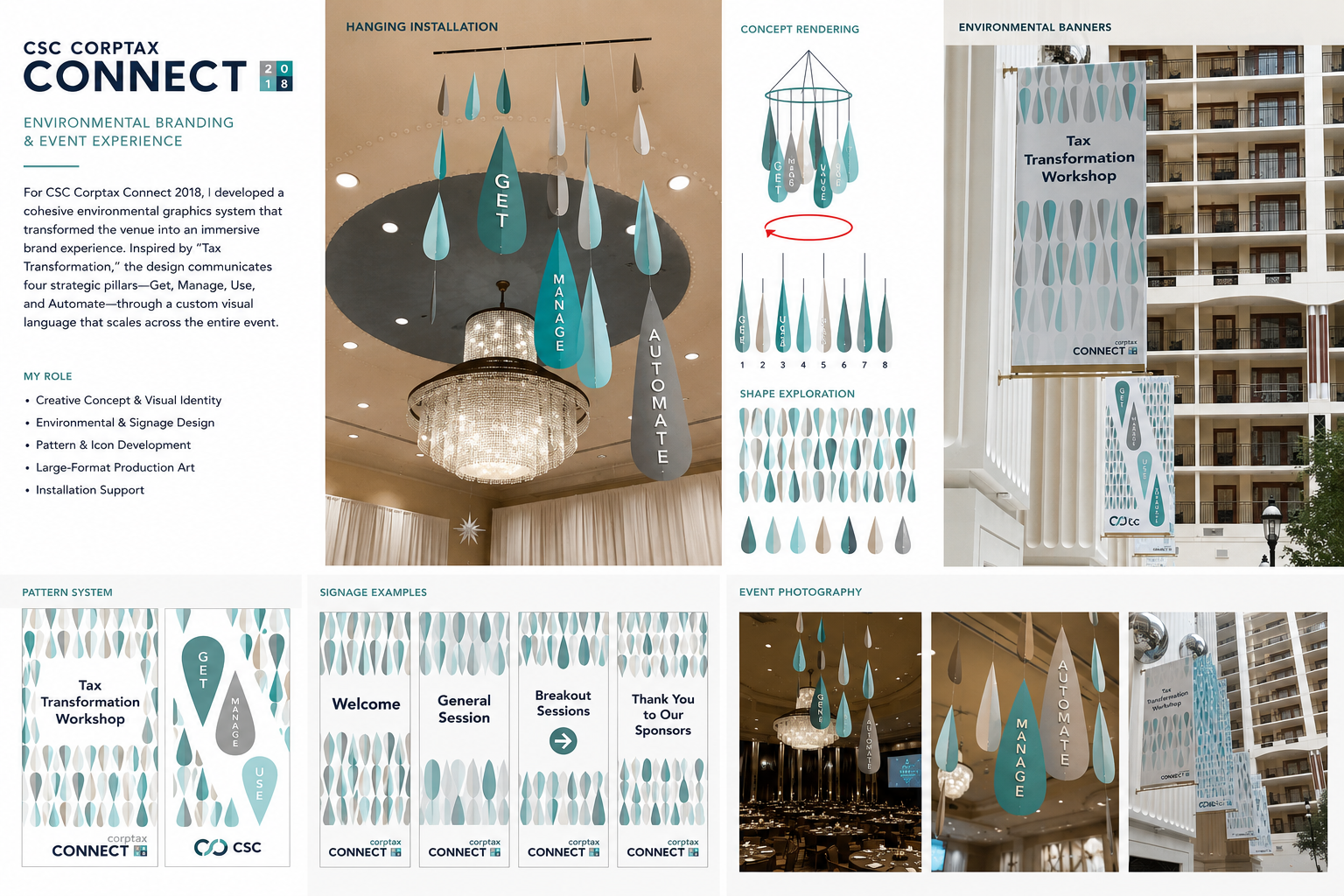
Execution and production of the environmental branding system for CSC Corptax Connect 2018, built around the event's "Tax Transformation" concept and its four strategic pillars - Get, Manage, Use, and Automate.
Deliverables included:
Hanging installation - large-scale teardrop mobiles suspended from the ballroom ceiling, each labeled with a pillar, built on EPVC substrate with grommets and rigging hardware
Environmental banners - large-format banners for the venue's exterior and balcony areas
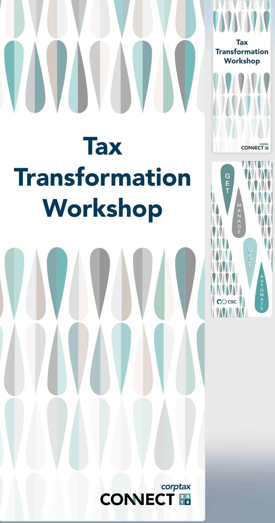
Wayfinding & session signage - a full set of directional and session banners (Welcome, General Session, Breakout Sessions, Thank You to Our Sponsors)
Pattern & icon production - a repeating teardrop pattern system carried consistently across every touchpoint
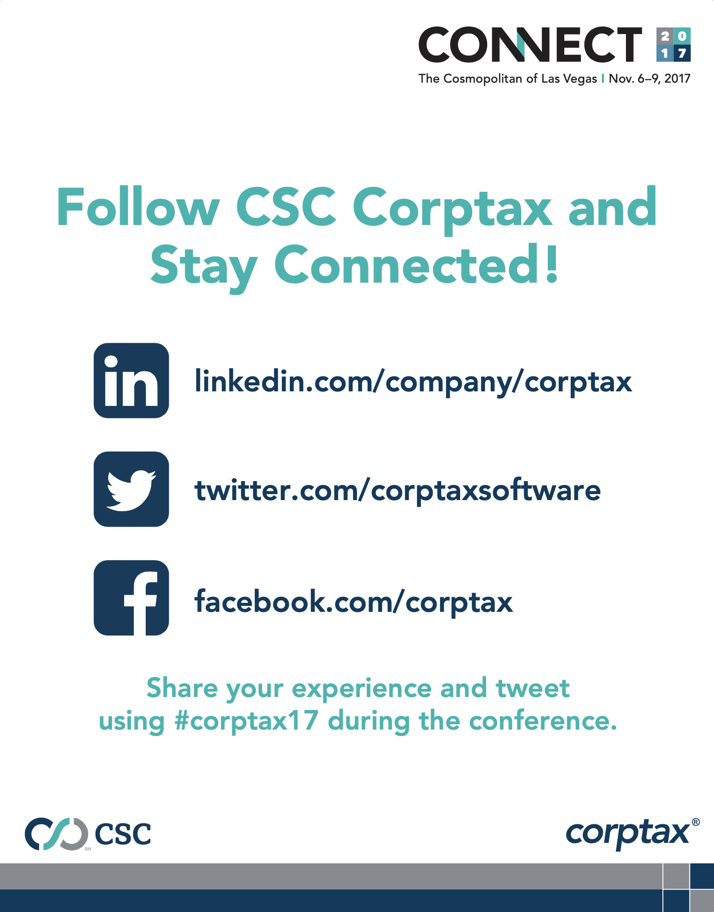
Large-format production art - banners, mobiles, contest cards, welcome signs, marketing posters and table tops, cherry blossom banners, and X-TEND banner systems
The result was a cohesive environmental graphics system that carried a single visual language across the entire event - from ceiling to signage to banners - giving the space an immersive, on-brand presence.
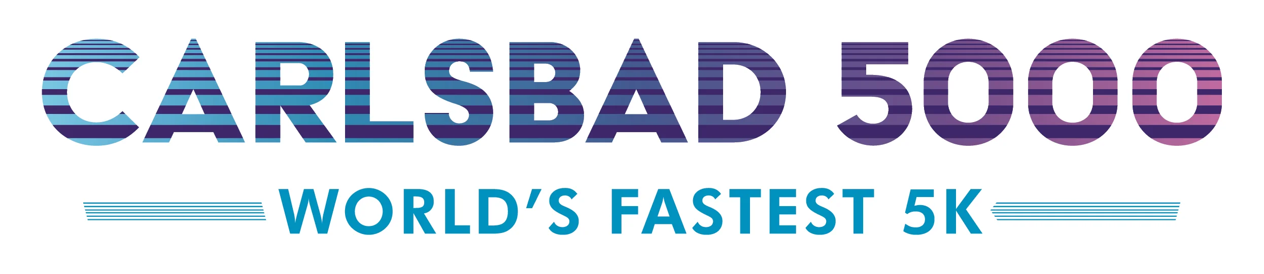
Carlsbad 5000 Logo Rebrand
Logo Design & Brand Identity
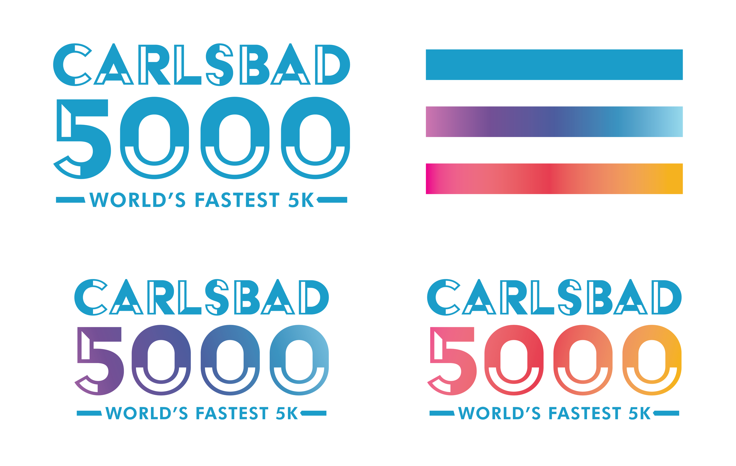
A logo rebrand for the Carlsbad 5000, refreshing the race's identity with a design that feels energetic and current while staying true to its running-event roots. The project moved through multiple rounds of concepting to arrive at a final mark that could scale across race merchandise, signage, and marketing materials.
Deliverables included:
Concept exploration - multiple rounds of logo concepting to explore direction, tone, and typography before narrowing to a final direction
Final logo suite - a finished logo system with variations for different applications and formats
The final identity gives the Carlsbad 5000 a clean, versatile mark that works across everything from race-day signage to apparel.
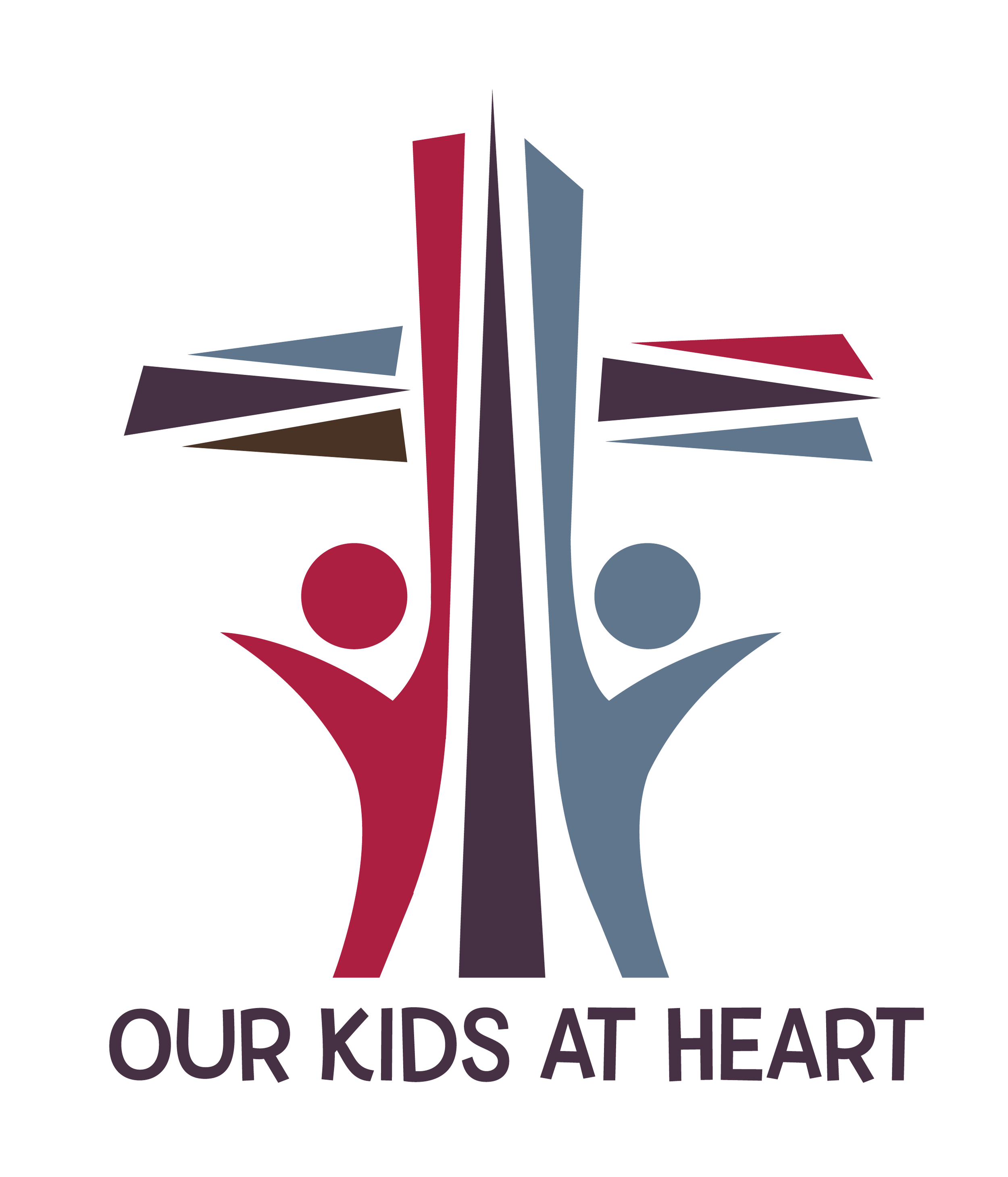
Non Profit - Our Kids at Heart Branding
Inspiring Hope and Transforming Lives
OUR MISSION
We help provide an opportunity for disadvantaged parish families to send their children to Catholic school, who would have otherwise never had the opportunity, by providing tuition support.
Our Kids at Heart was founded in July 2017 by Father Mark Hamlet, Pastor of Sacred Heart Catholic Church in Northeast Austin. At Our Kids at Heart, we support the Parish Partner School Program and aim to expand this program to other diocesan parishes.
OUR VISION
To grow Catholic Education in Central Texas through the expansion of the Partner School Program to other Diocesan
Parishes.https://www.facebook.com/ourkidsatheartatx/?ref=page_internal
Shopper Marketing Campaign
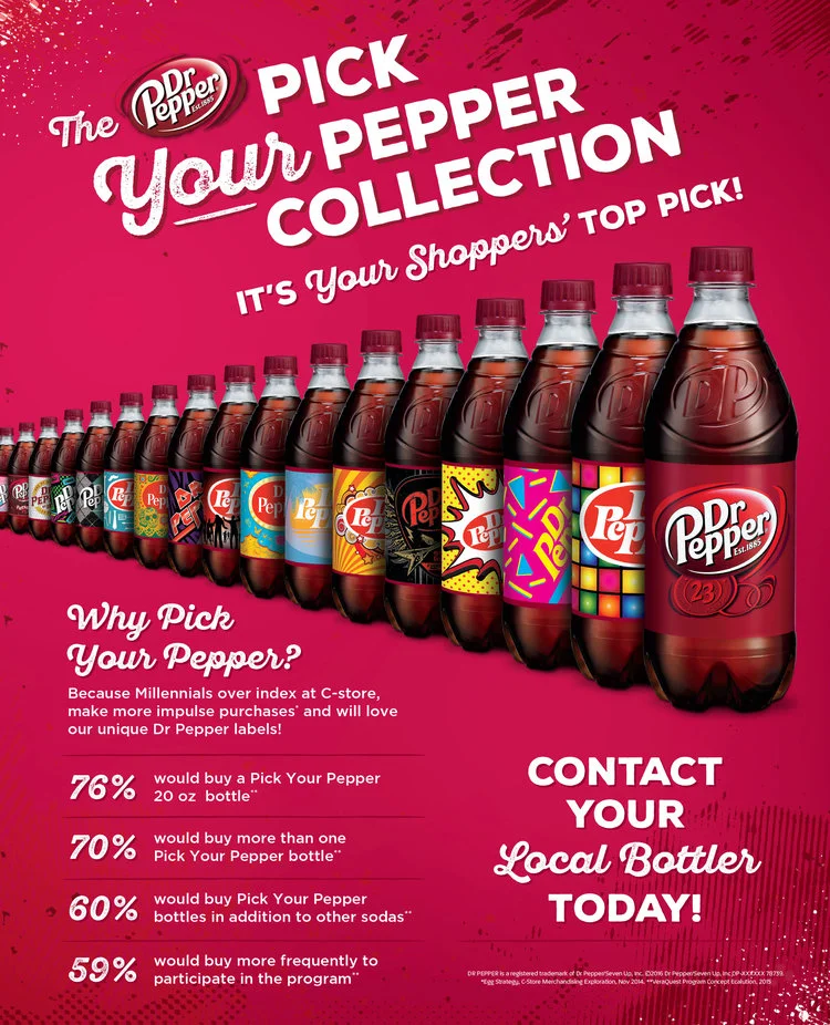
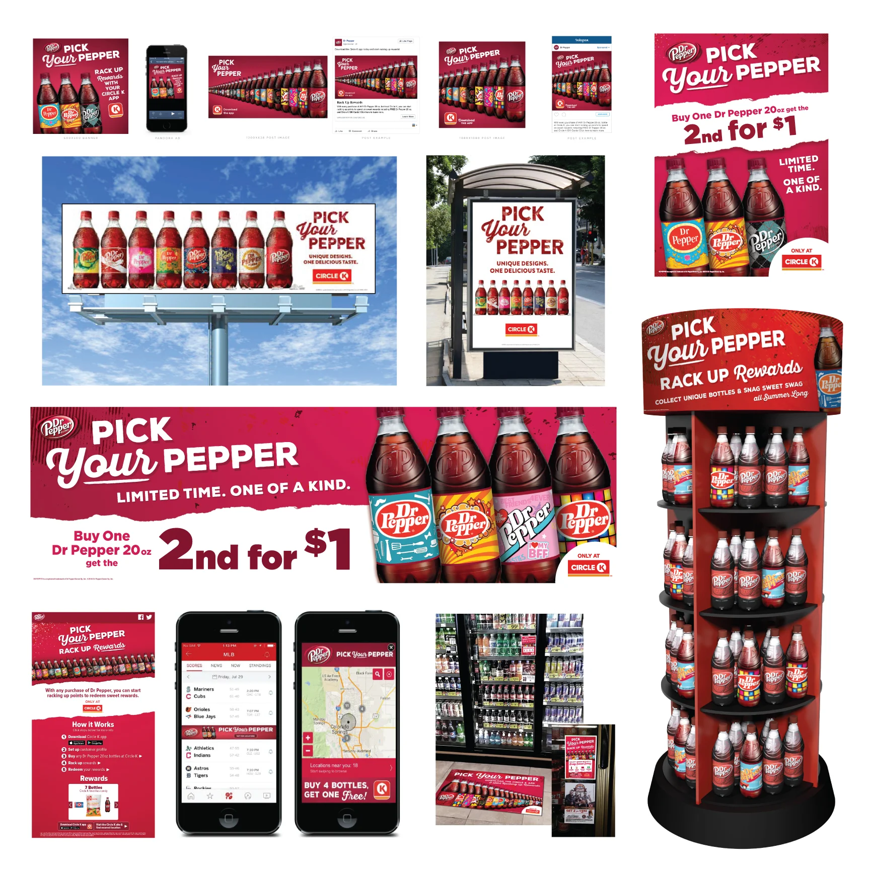
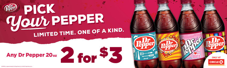
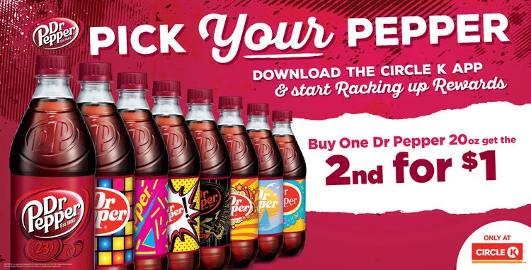
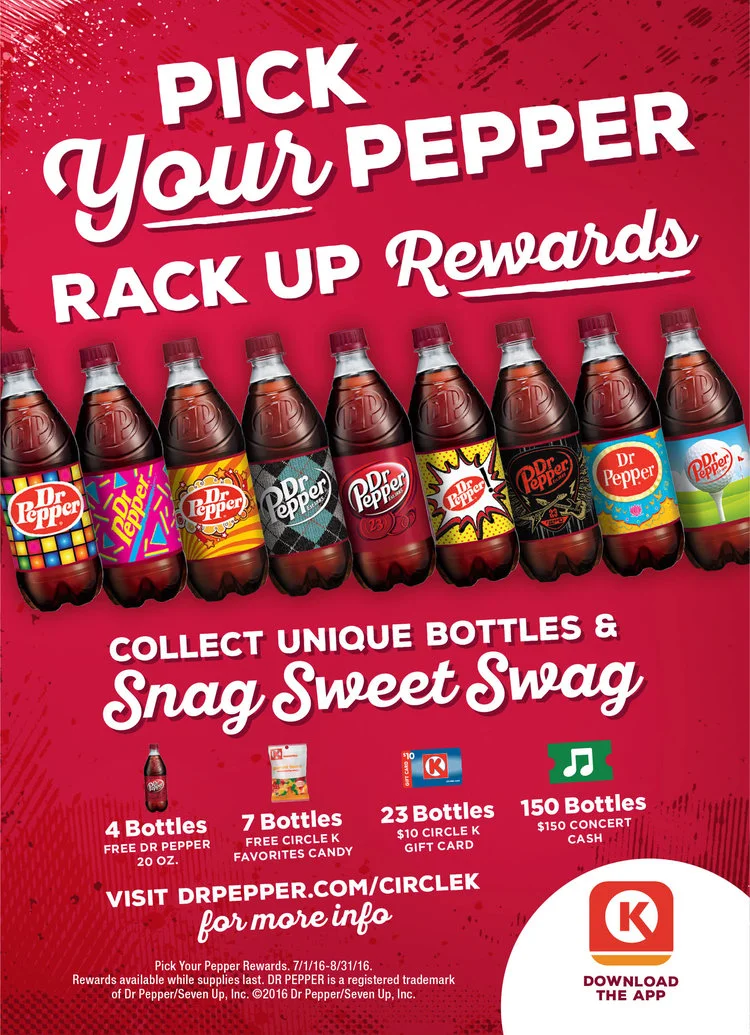
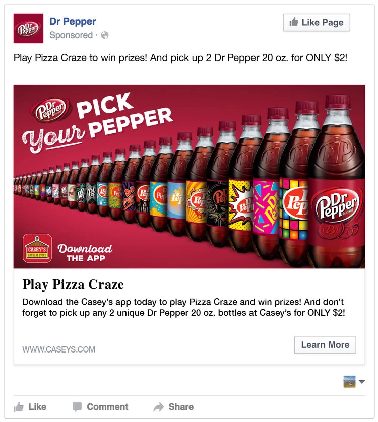
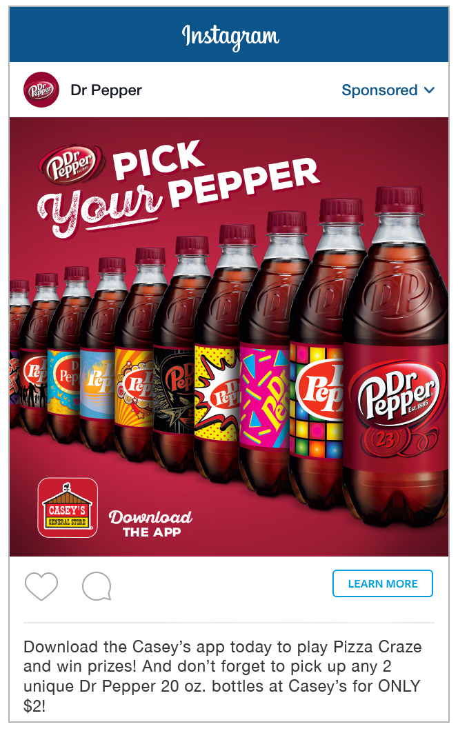
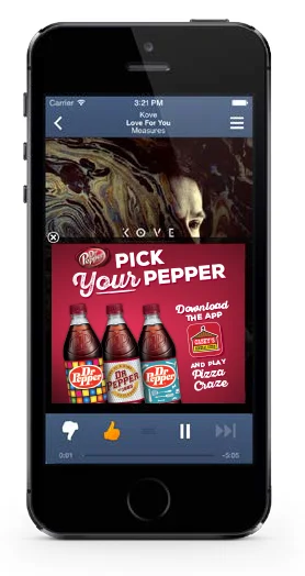
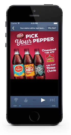
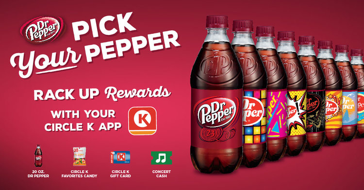
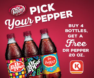
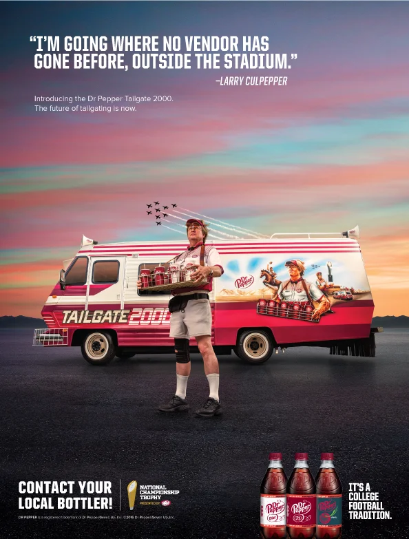
A multi-channel campaign built to drive trial and engagement for Dr Pepper's flavor lineup across retail and digital touchpoints. As part of the creative team, I designed a full suite of assets that carried a consistent "Pick Your Pepper" look across print, convenience-store POP, and digital media.
Deliverables included:
Convenience store POP - Circle K gas pump toppers and window clings designed to catch shoppers at the point of purchase
Print advertising - CSP (convenience store/petroleum) print ads and large-format horizontal signage
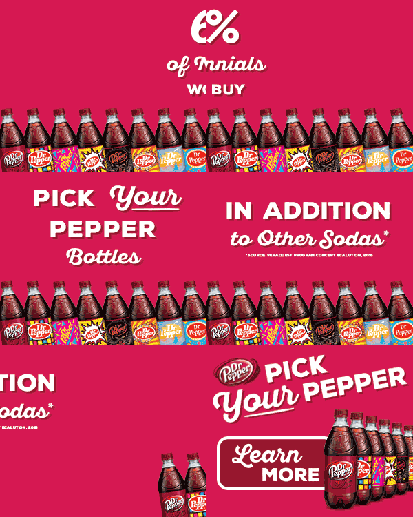
Digital banners - a full set of animated and static for online media placements
Social creative - Facebook and Instagram assets extending the campaign into shoppers' feeds
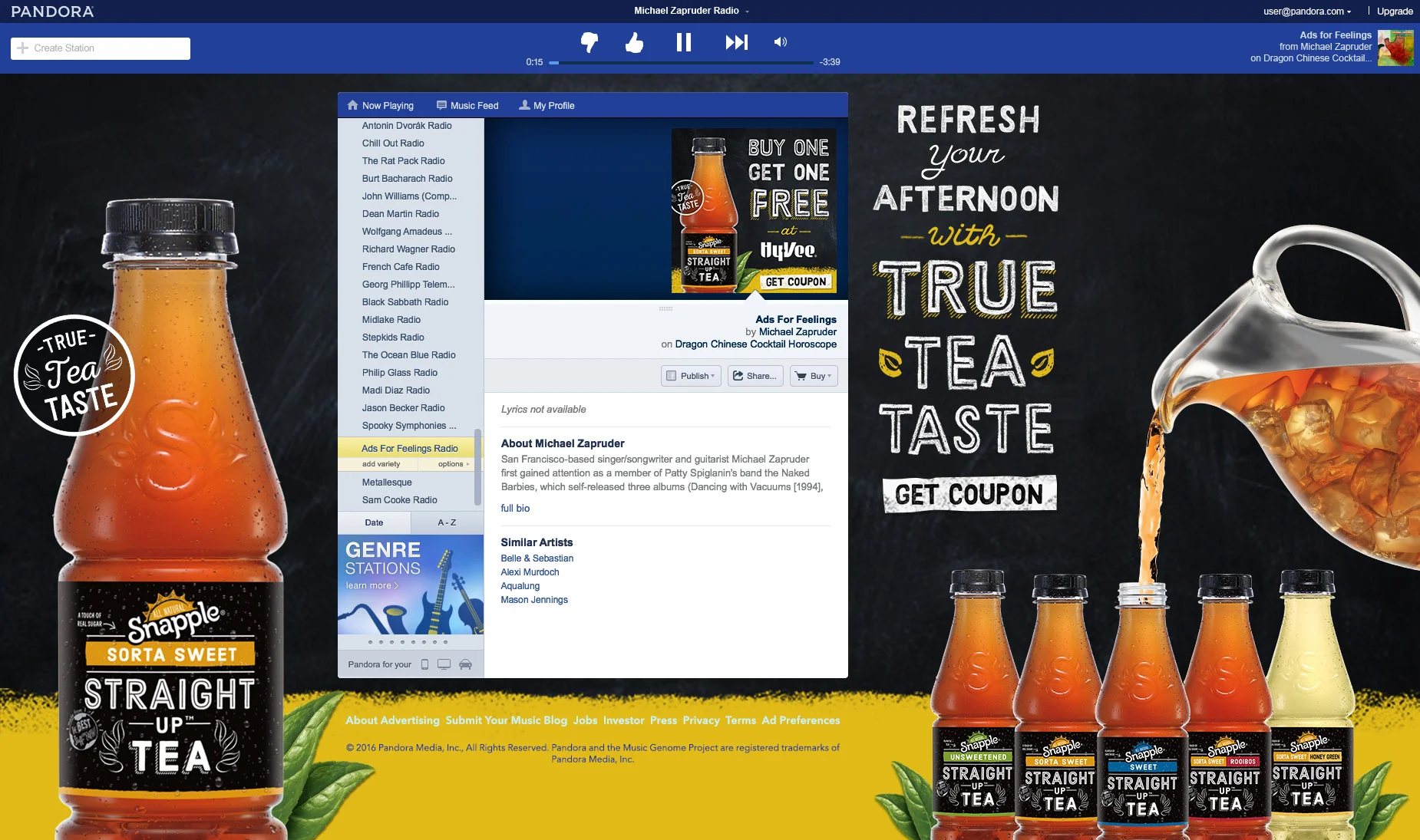
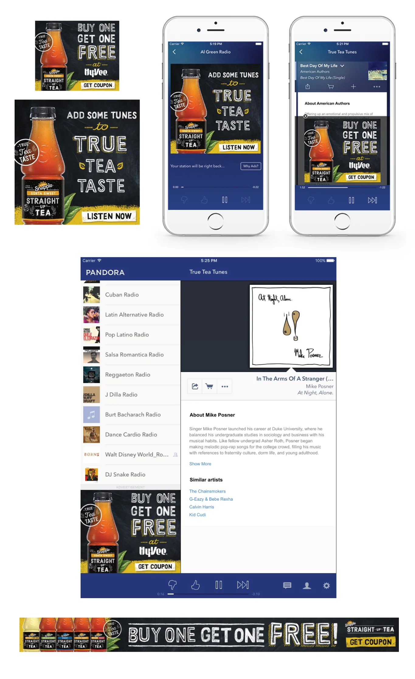
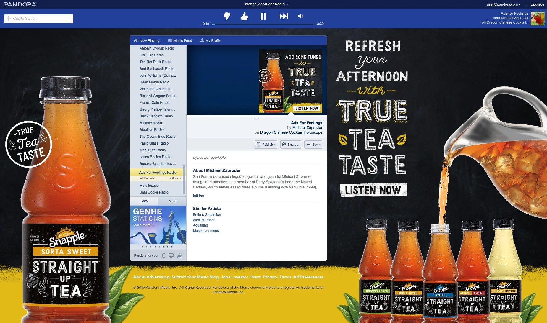
Pandora sponsorship creative - custom banner units built for Pandora's audio ad platform
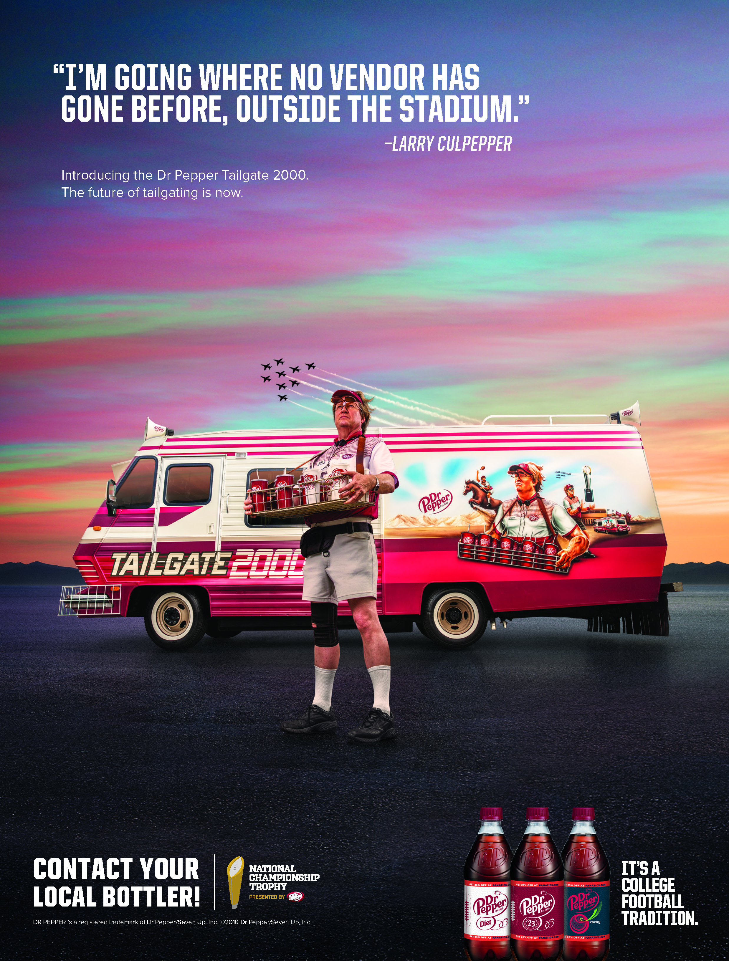
CSP Print Ad
Shopper Marketing Campaign
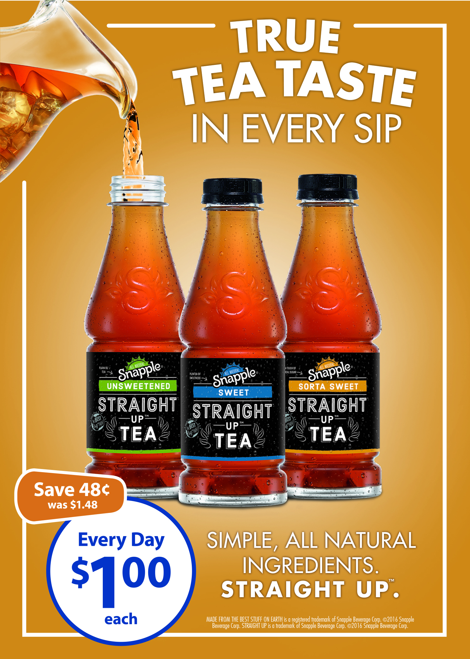
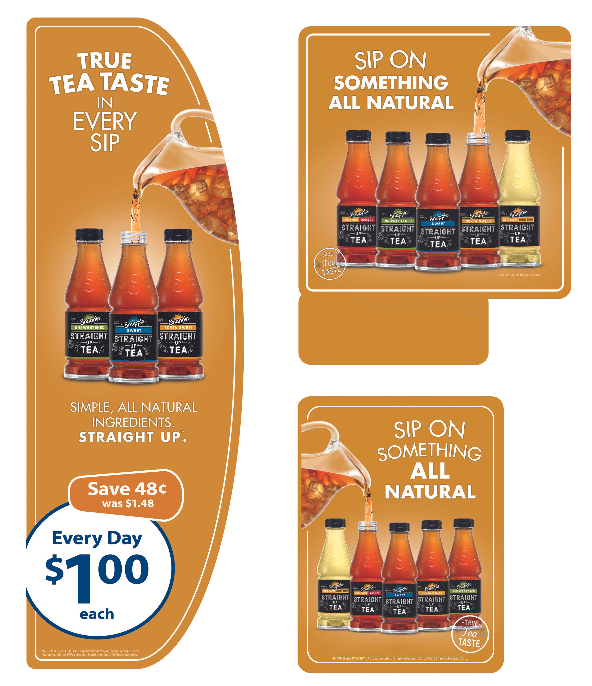
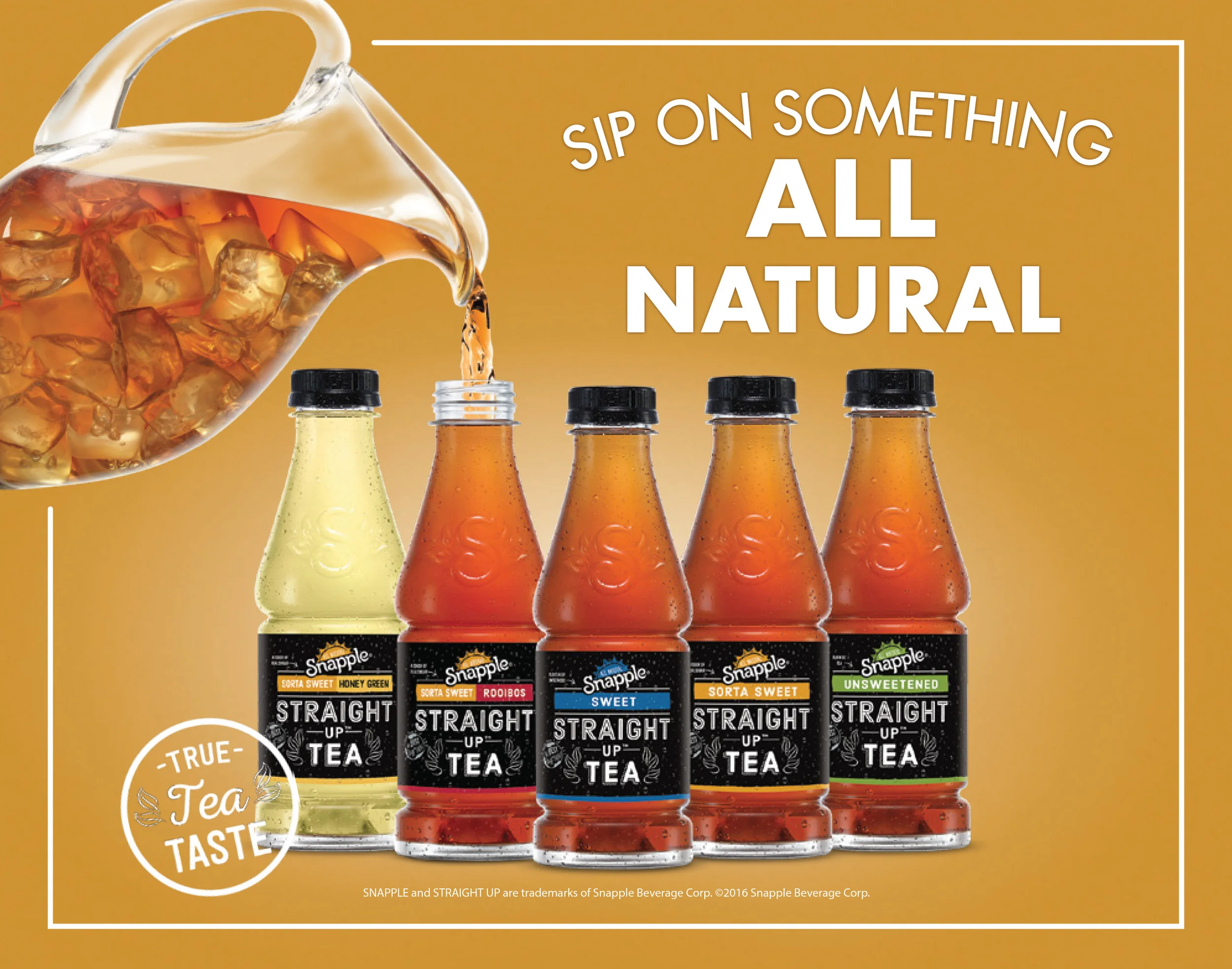
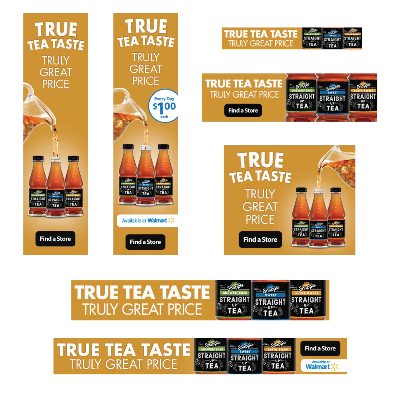
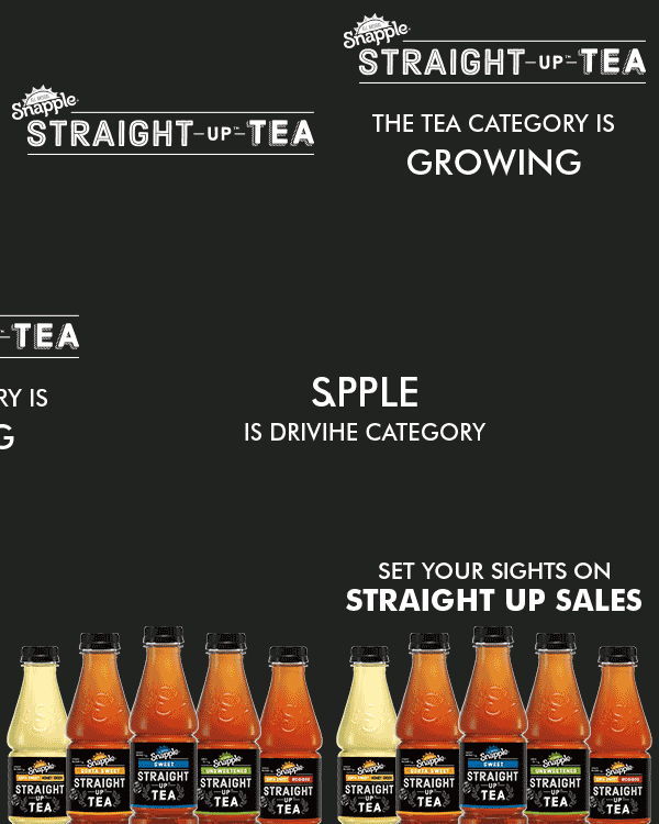
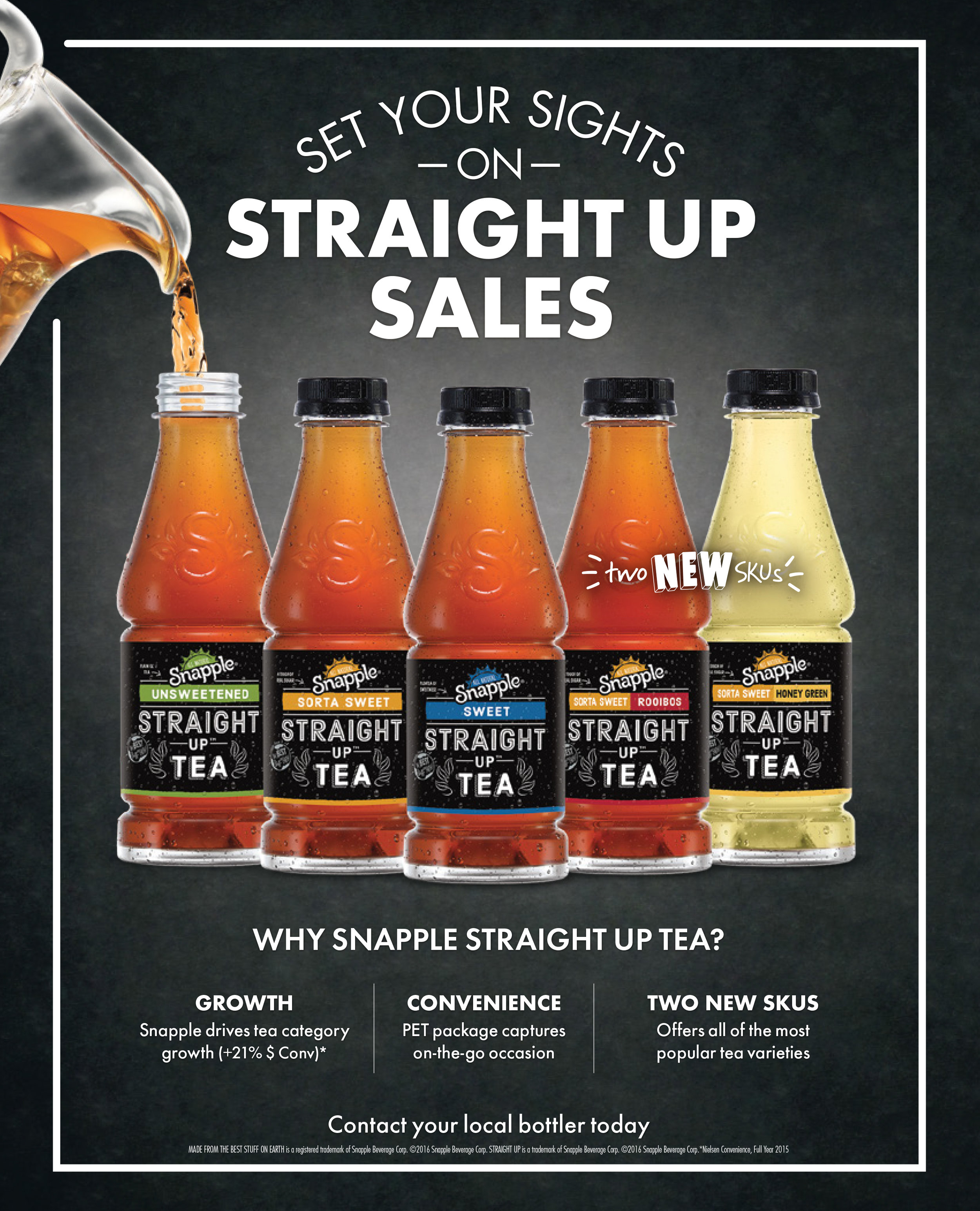
A full shelf-to-screen campaign built to introduce and promote Snapple's Straight Up Tea line at retail. I designed a broad set of assets aimed at catching shoppers throughout the path to purchase - from the cooler door to the checkout aisle to their phone screen.
Deliverables included:
In-store signage - vault clings, static clings, and aisle violators designed to stand out on shelf and in the beverage aisle
Cooler and cart ads - cooler door clings and retailer cart advertising (including a placement for Ahold) to reach shoppers right at the point of decision
Print advertising - print ads supporting the product launch
Digital banners - a full range of static and animated banner sizes (970x60, 300x250, 320x50, and more) for online media buys
The campaign carried a clean, consistent "Straight Up Tea" identity across every format, giving the brand a strong shelf presence while extending the same look into digital media.
Series of Vault Clings, Static Clings, Aisle Violators, Print Ads, Digital Banners, and Animated Banners
A full shelf-to-screen campaign built to introduce and promote Snapple's Straight Up Tea line at retail. I designed a broad set of assets aimed at catching shoppers throughout the path to purchase - from the cooler door to the checkout aisle to their phone screen.
Deliverables included:
In-store signage - vault clings, static clings, and aisle violators designed to stand out on shelf and in the beverage aisle
Cooler and cart ads - cooler door clings and retailer cart advertising (including a placement for Ahold) to reach shoppers right at the point of decision
Print advertising - print ads supporting the product launch
Digital banners - a full range of static and animated banner sizes (970x60, 300x250, 320x50, and more) for online media buys
The campaign carried a clean, consistent "Straight Up Tea" identity across every format, giving the brand a strong shelf presence while extending the same look into digital media.
7UP for Target
Retail Aisle Activation - 7UP
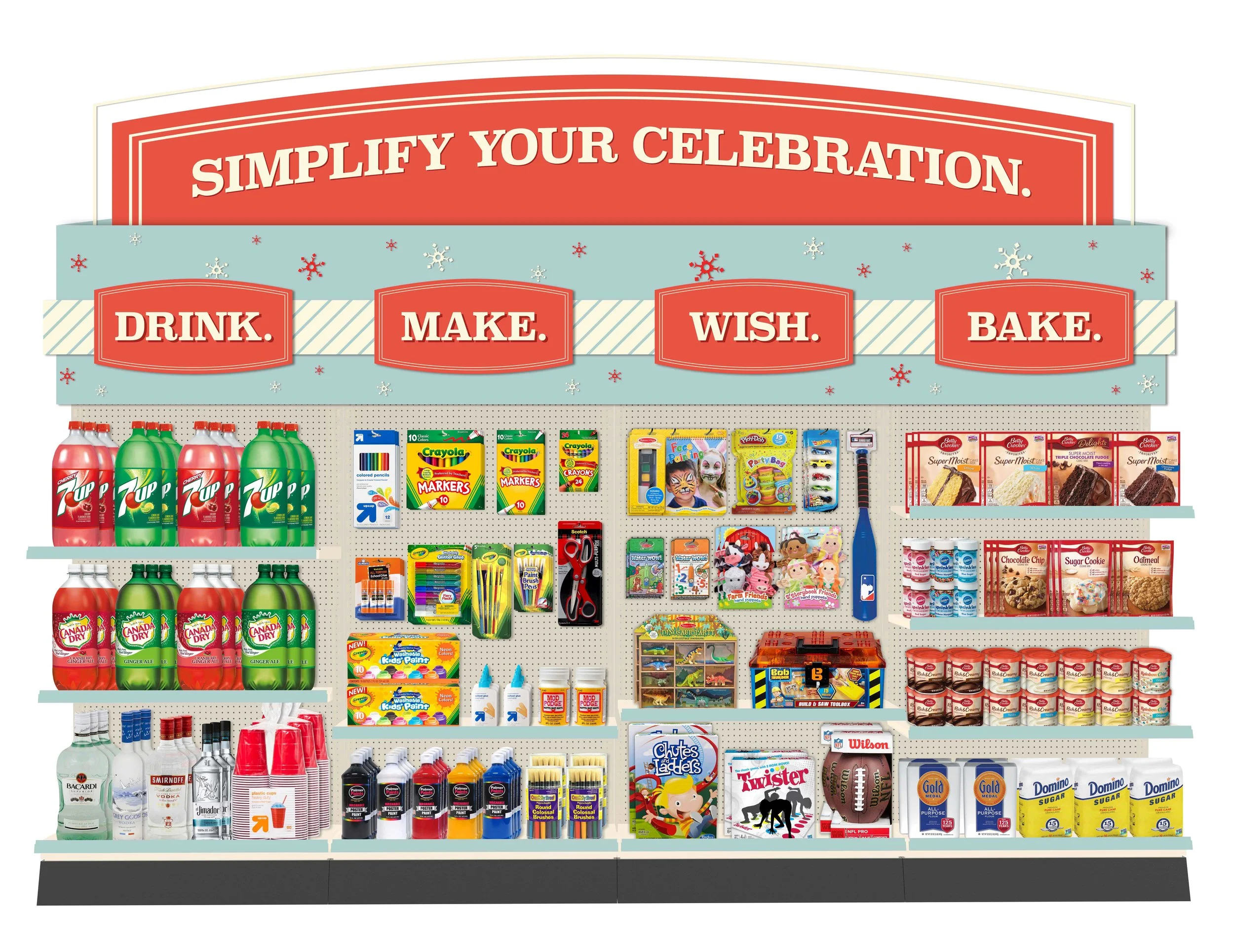
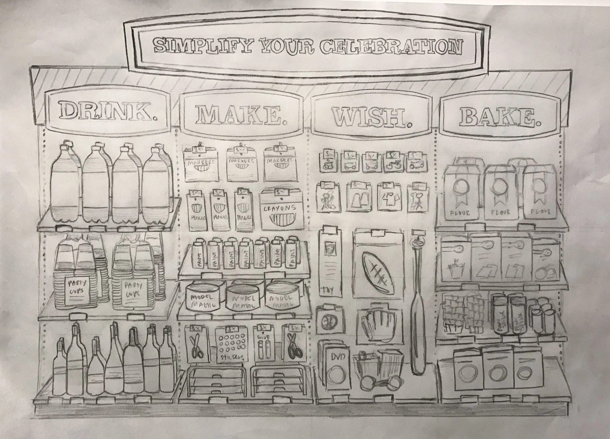
A retailer-specific in-store activation designed to give 7UP standout presence in the Target beverage aisle. The concept centered around a "Drink, Make, Wish, Bake" theme, tying the brand into baking and holiday occasions to encourage shoppers to pick up 7UP for more than just drinking.
Deliverables included:
Aisle design and layout - a full aisle concept sketch through to final front-of-aisle execution, giving the display a cohesive, on-brand look from concept to shelf
Retailer-specific creative - signage tailored to Target's in-store environment and merchandising standards
The result was a themed aisle activation that gave 7UP a clear, memorable presence at retail and connected the brand to an everyday use occasion beyond the beverage aisle.
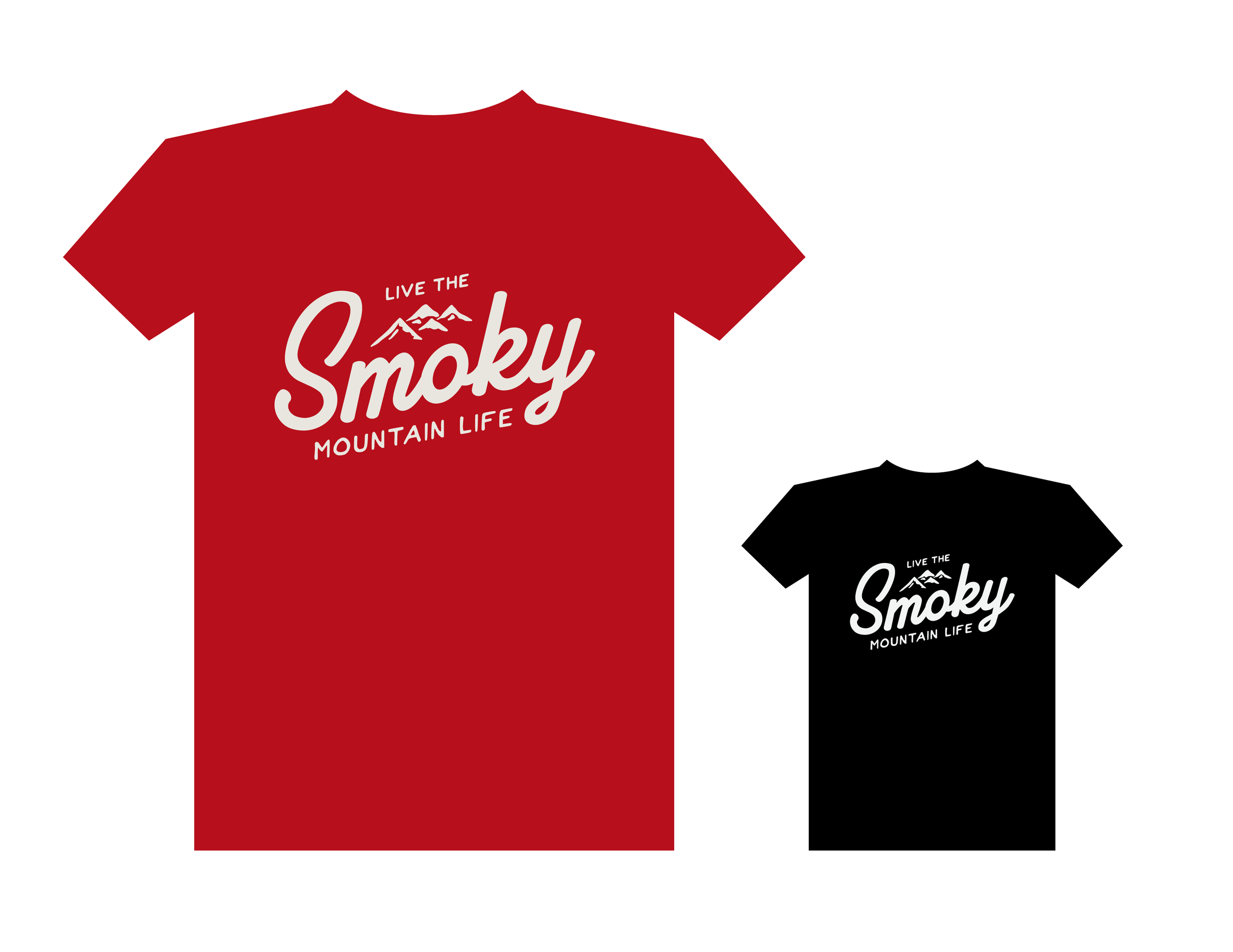
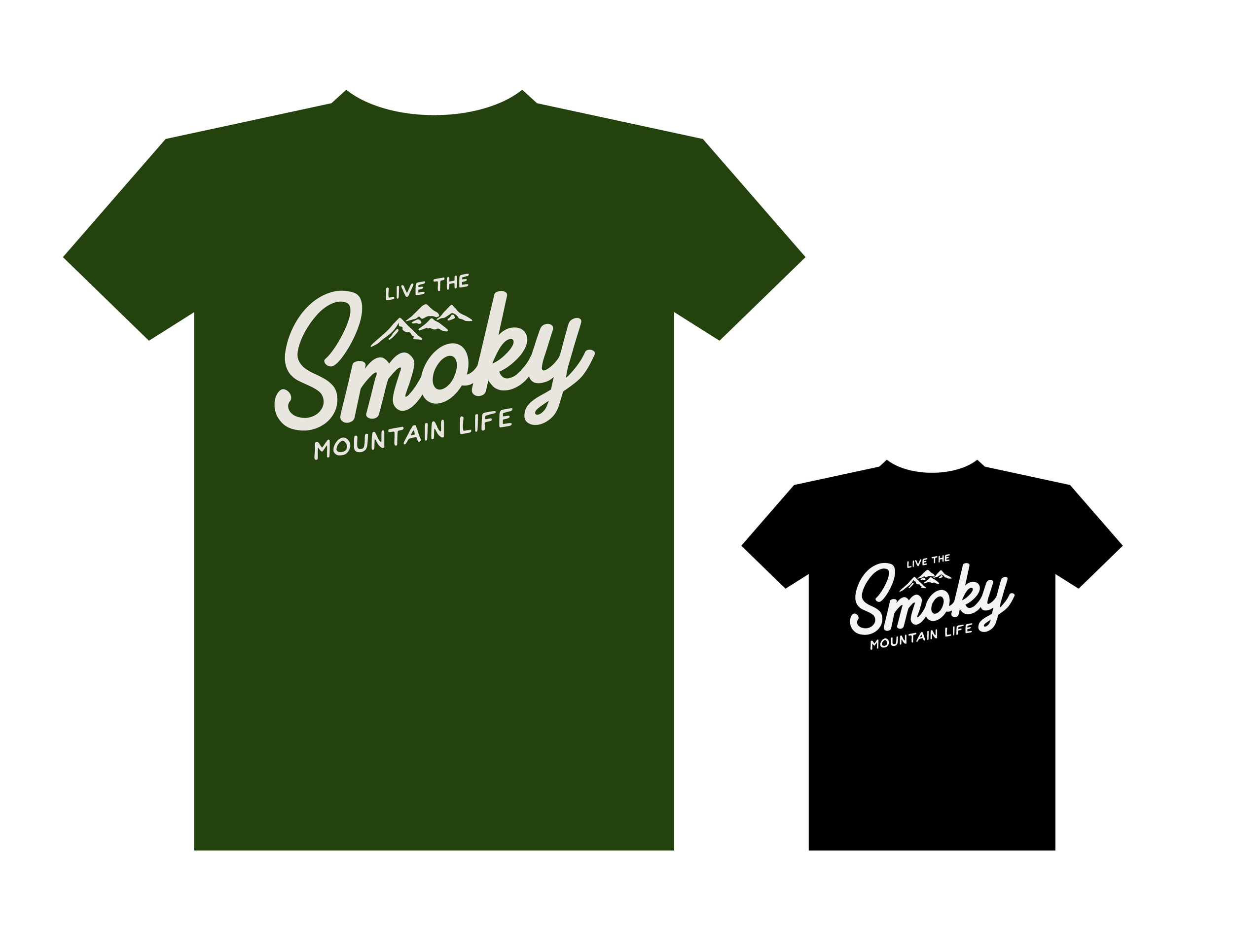
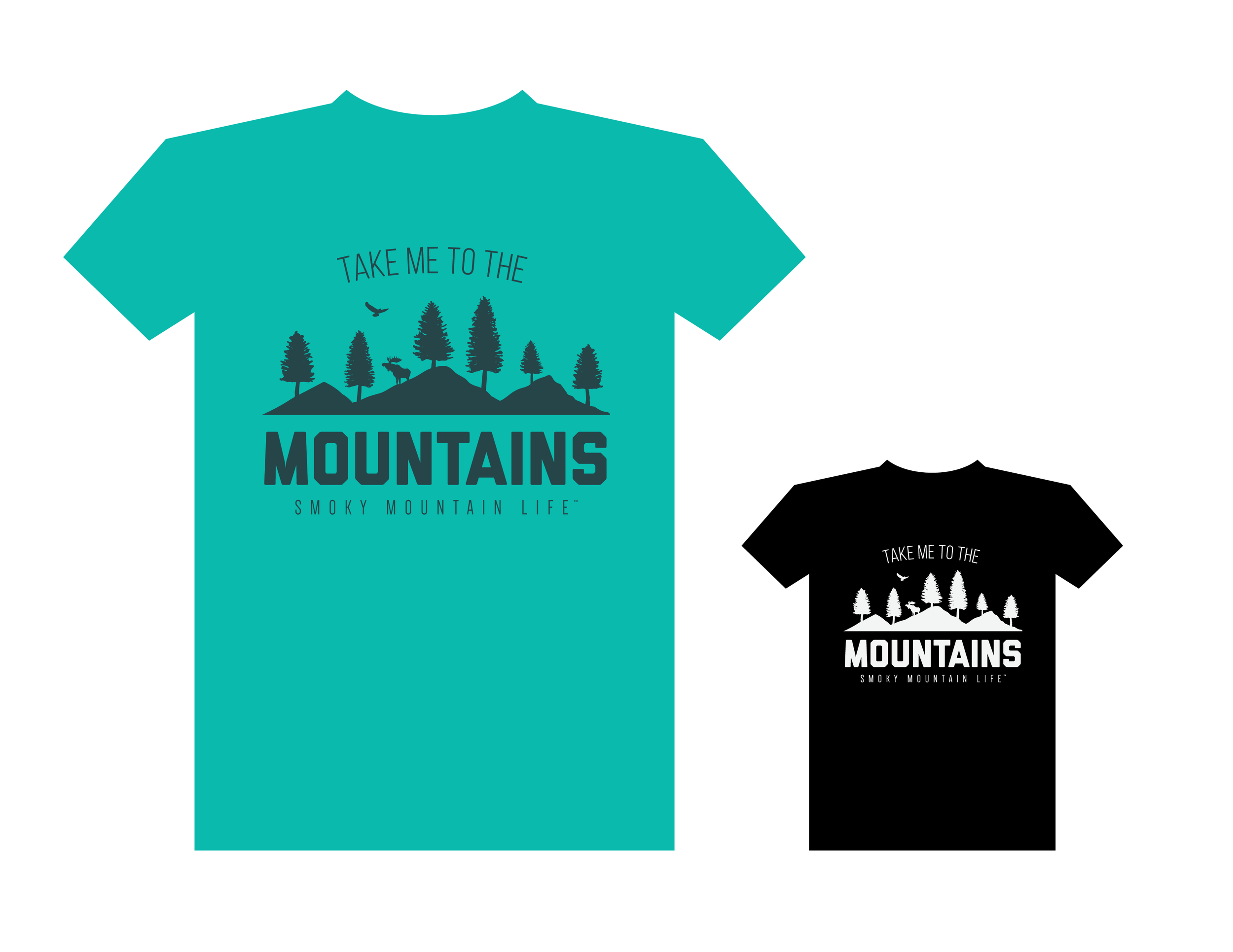
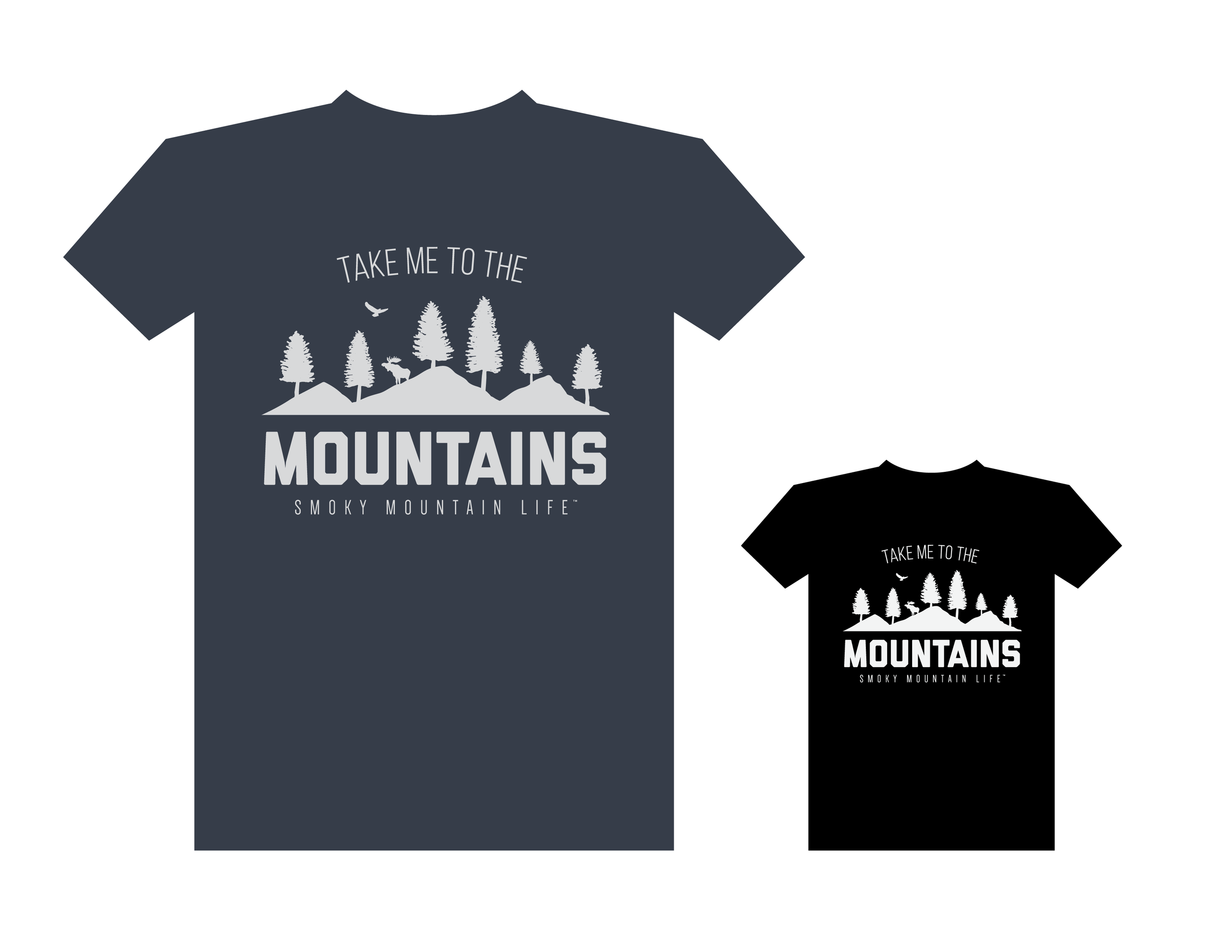
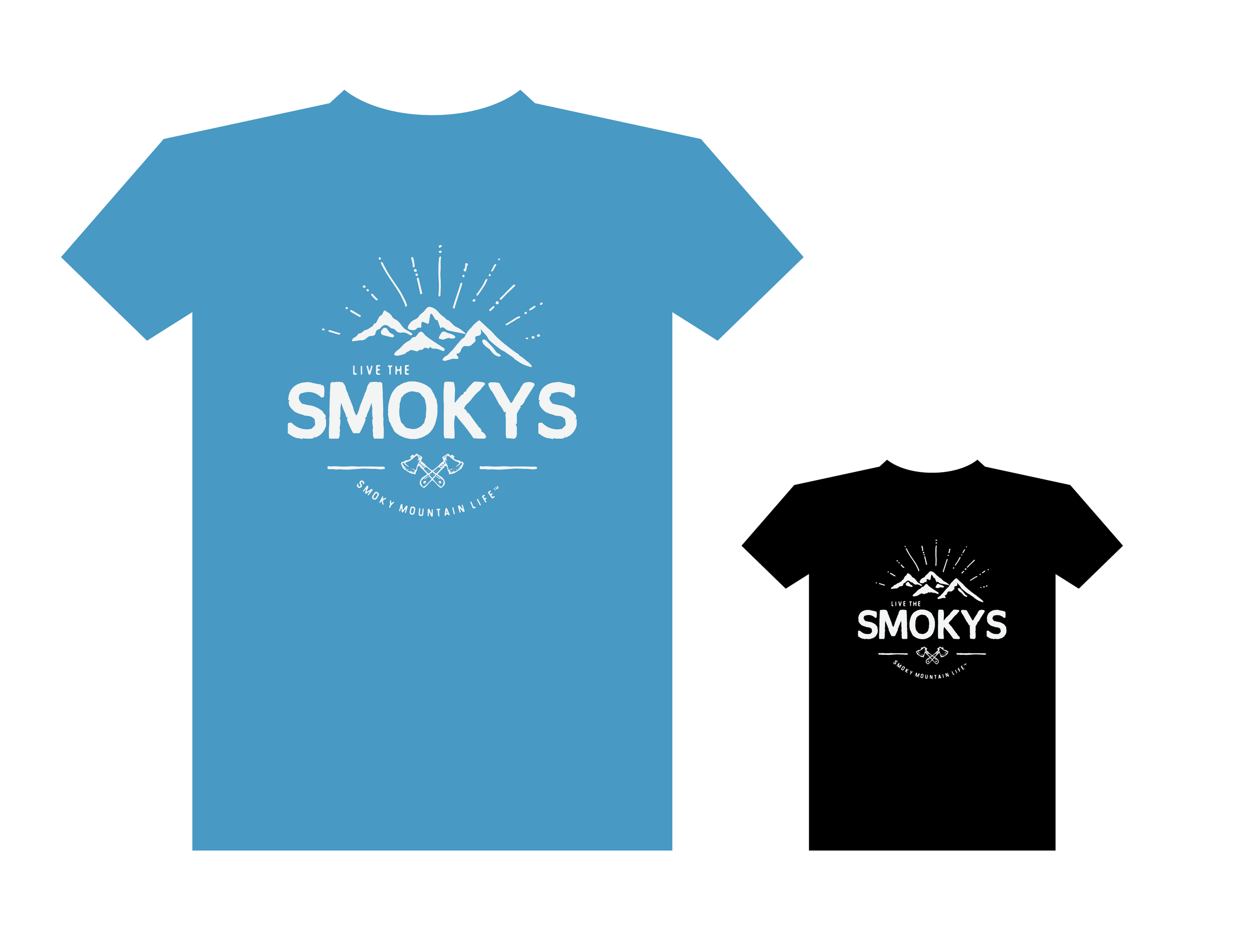
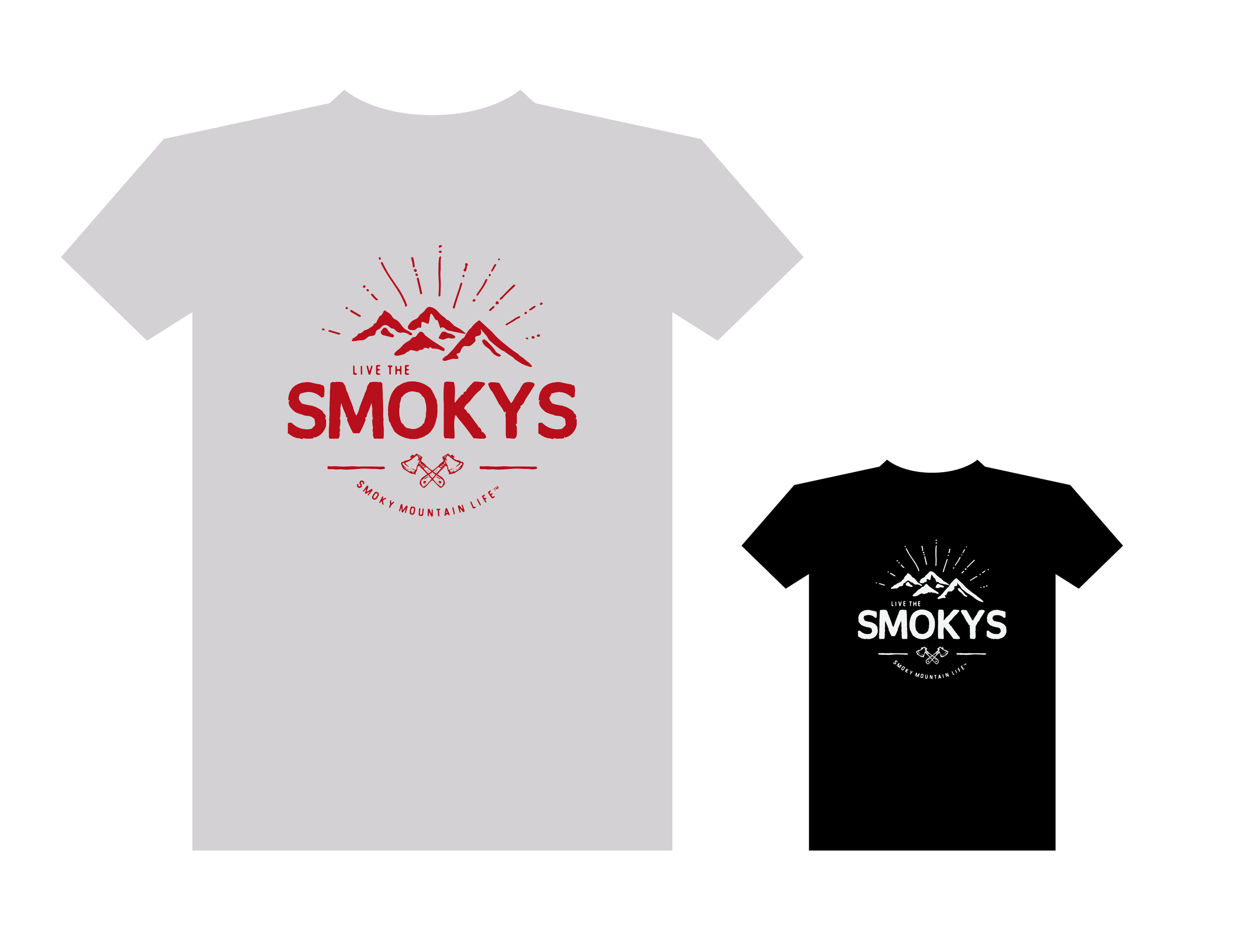
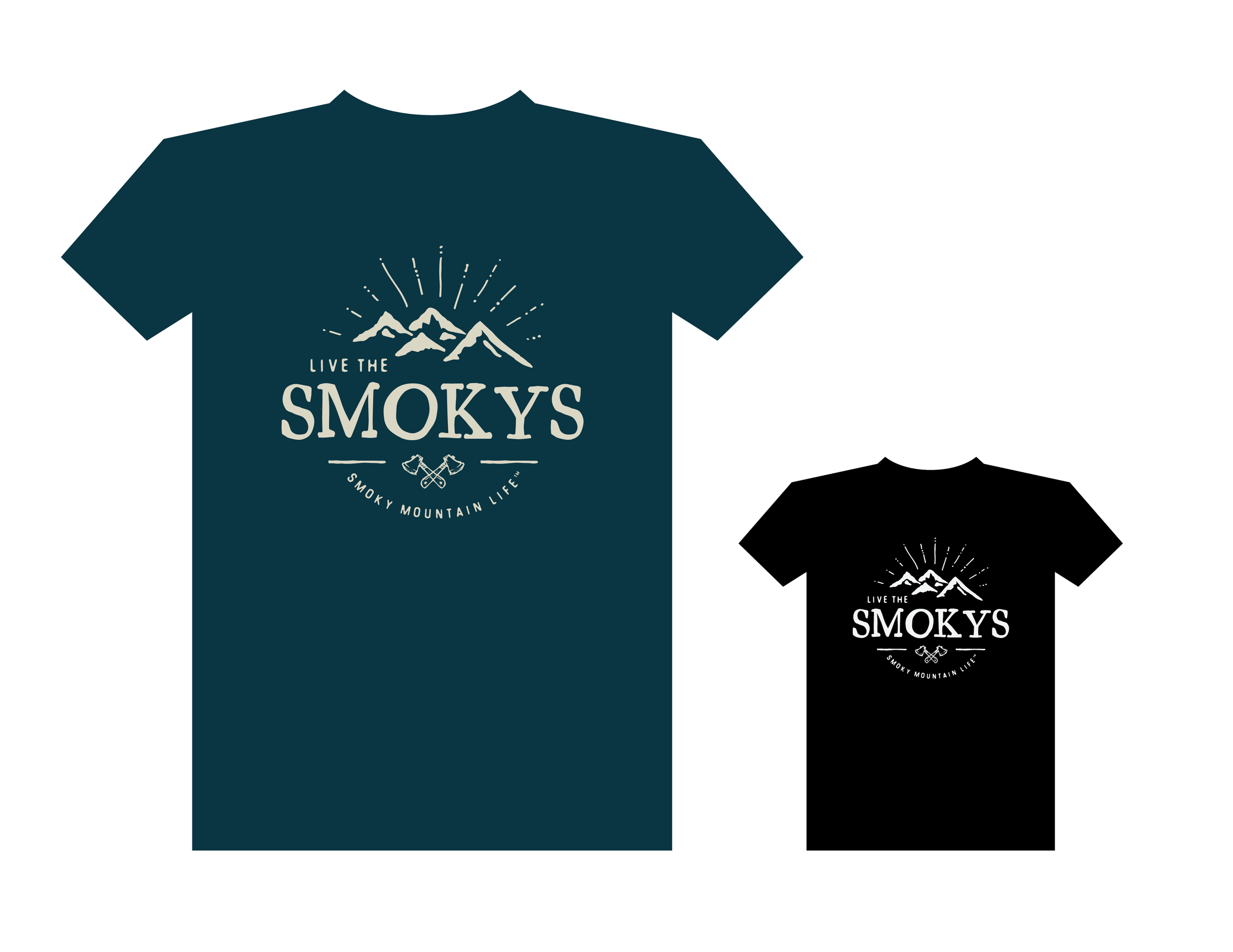
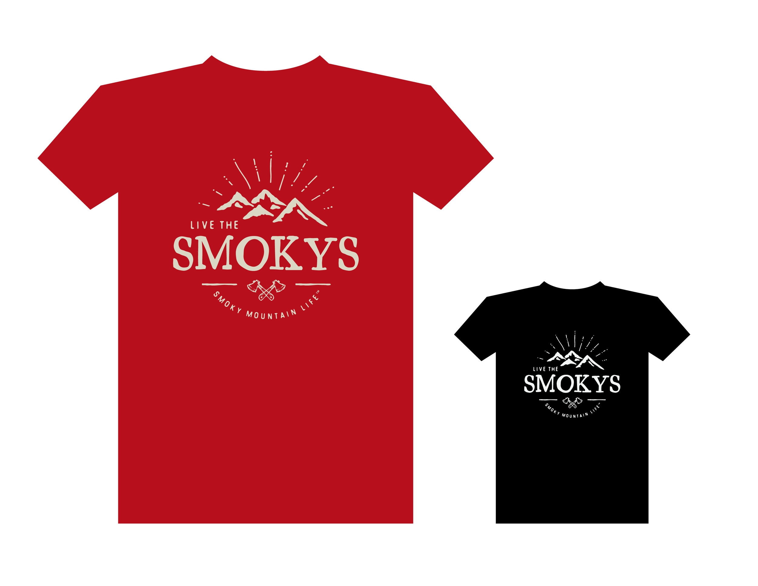
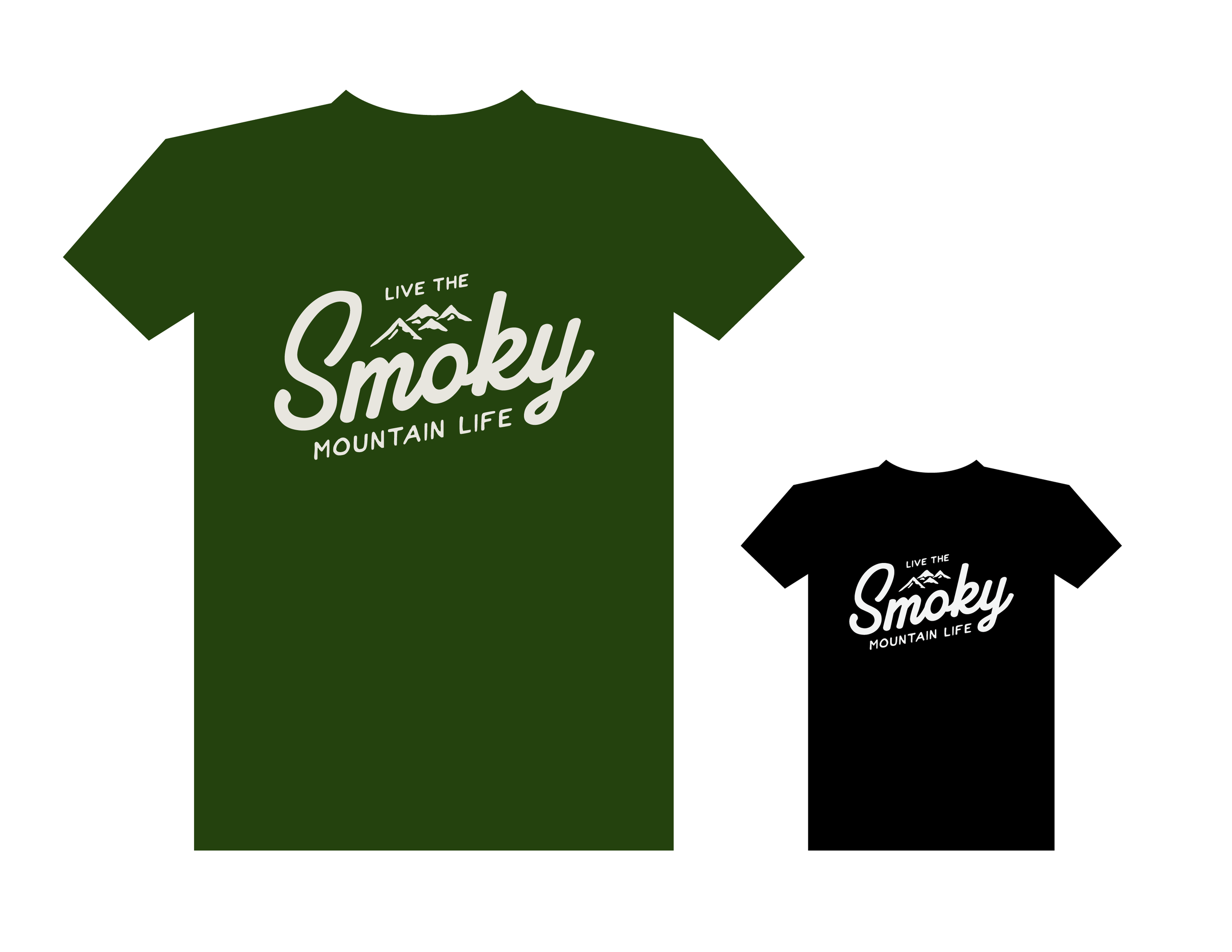
Smoky Mountain Life T-Shirt Designs
Logo & Apparel Design
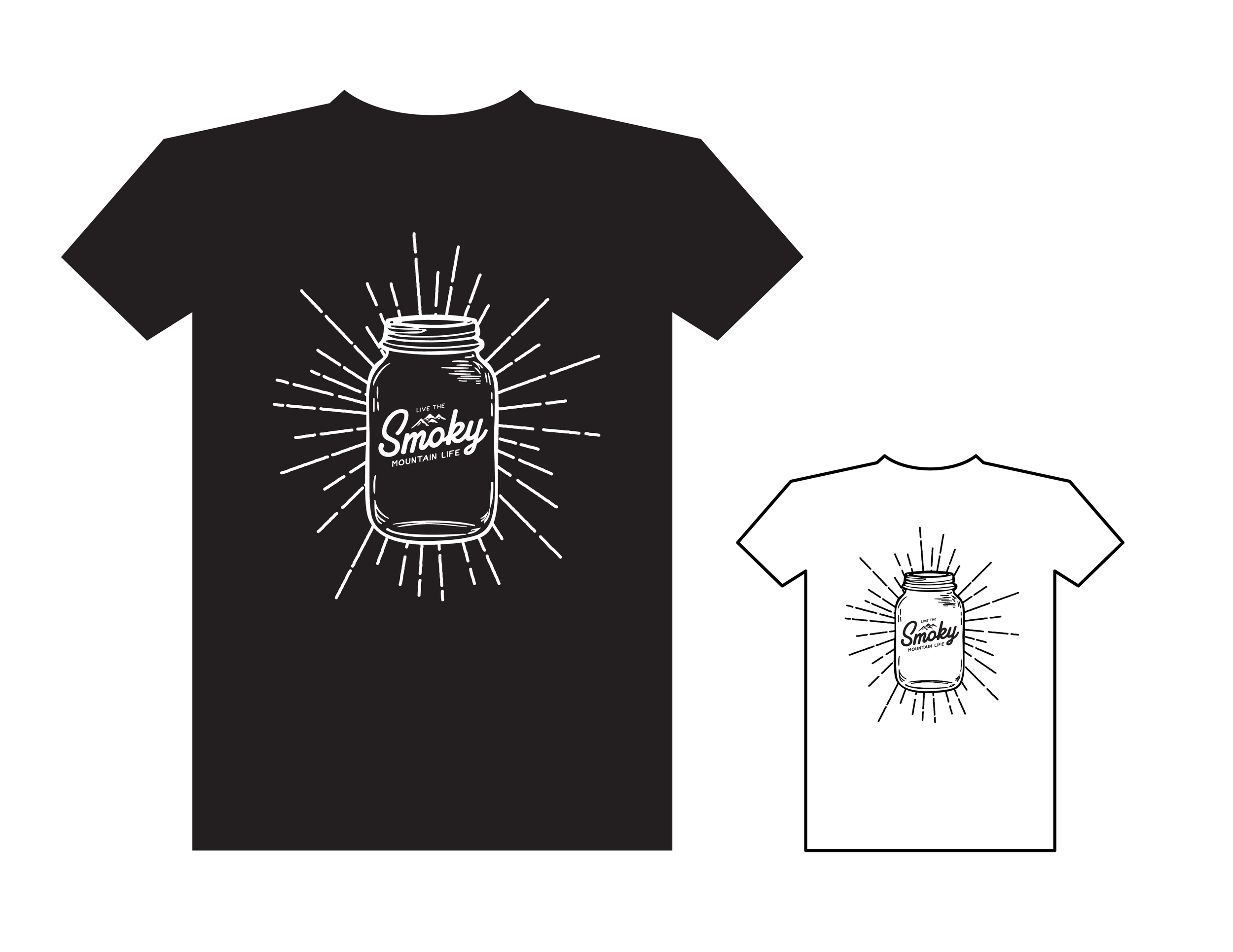
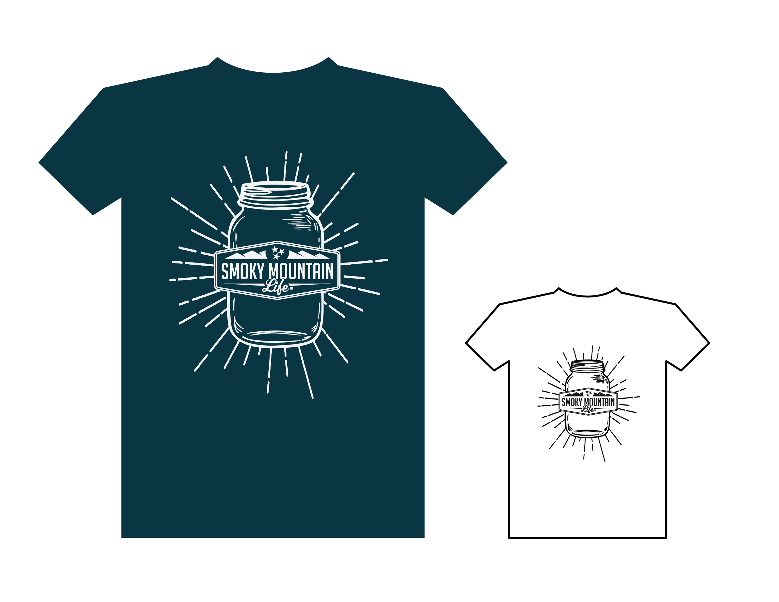
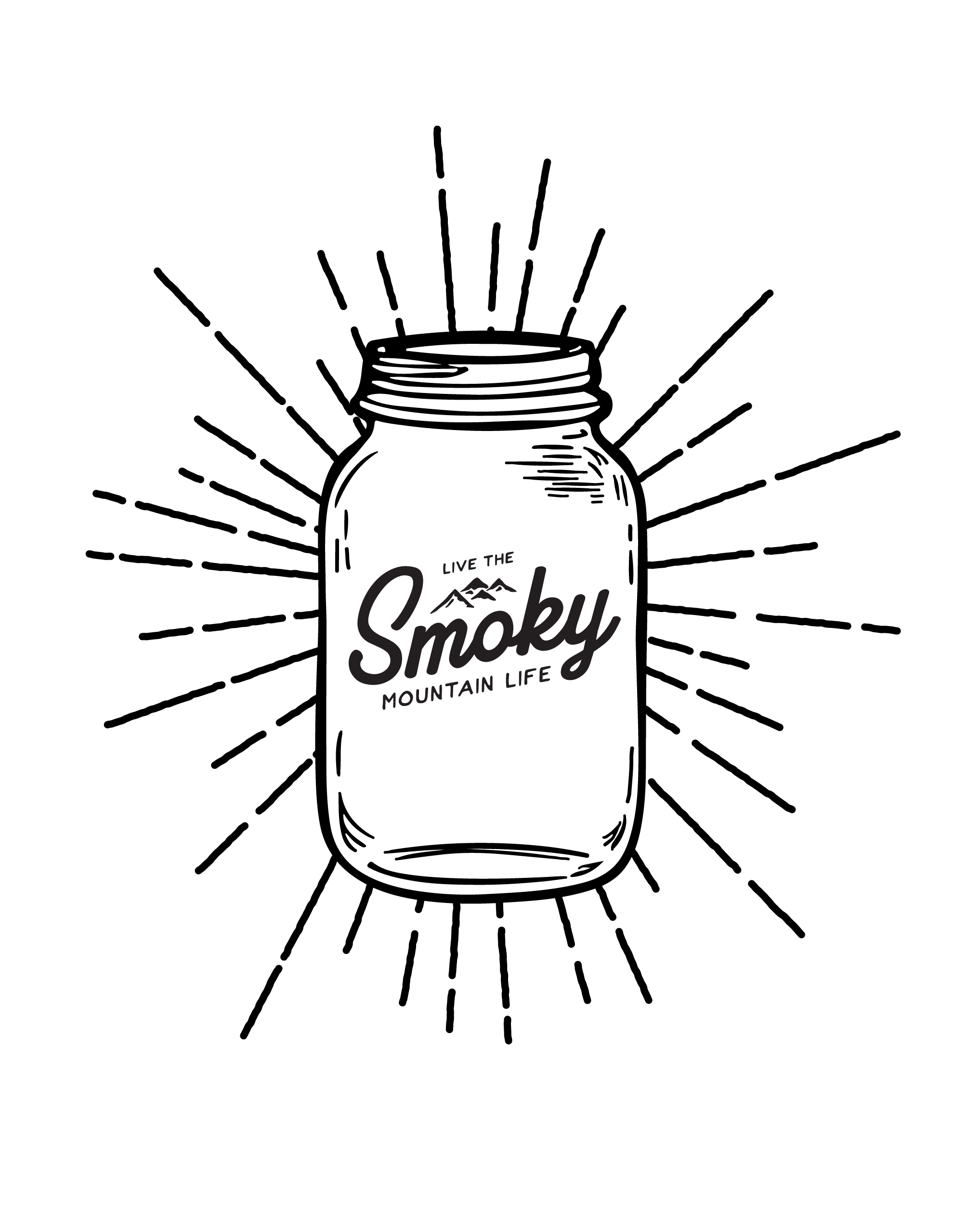
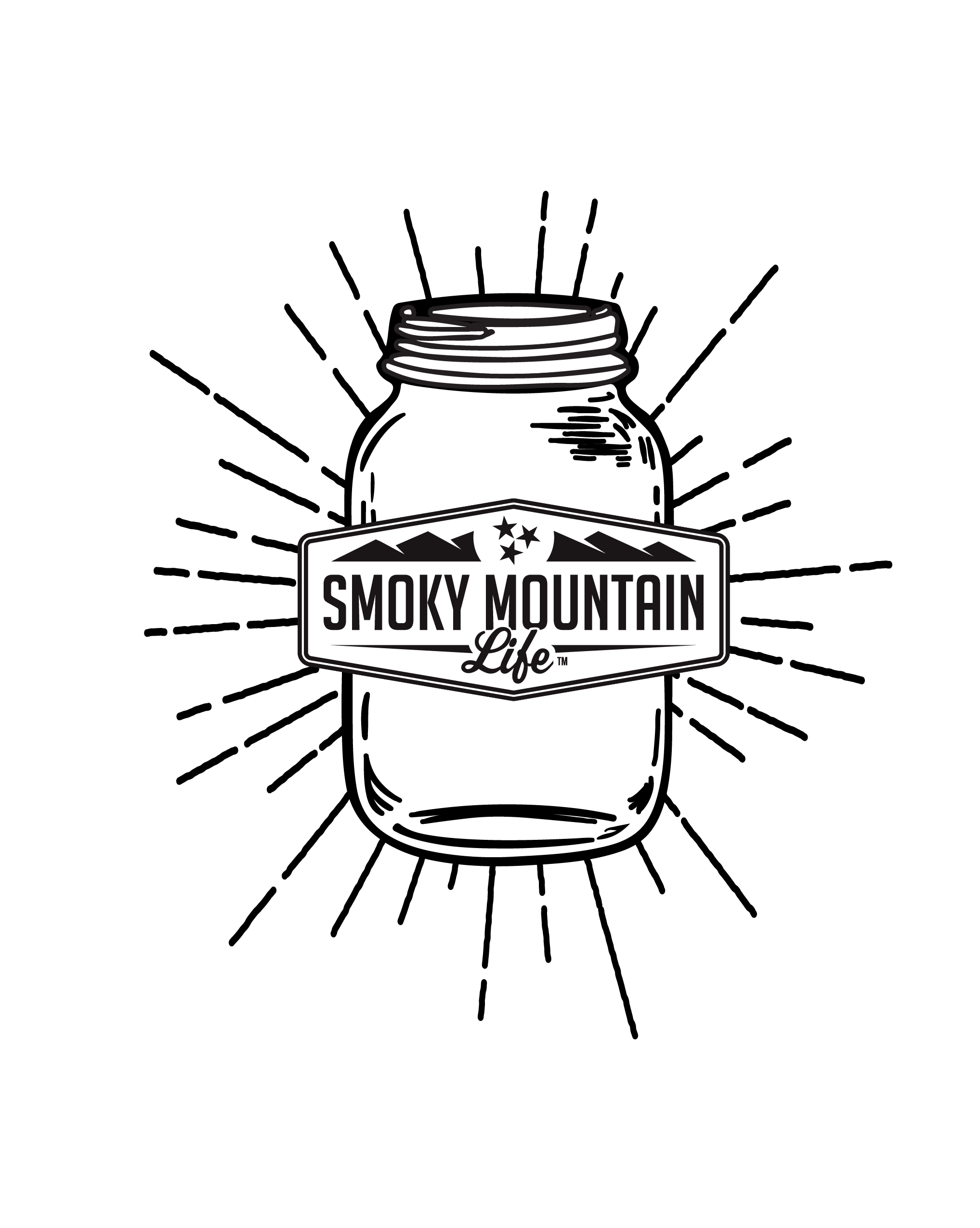
A collection of logo designs created for the Smoky Mountain Life brand's t-shirt line. Each design captures a different facet of the brand's outdoorsy, mountain-lifestyle identity, giving the line variety while keeping a consistent visual thread across the collection.
Deliverables included:
Multiple logo designs - a range of standalone logo marks, each built to work as a standout, print-ready graphic on apparel
Apparel-ready artwork - designs finalized for t-shirt printing across the product line
The result is a versatile set of graphics that let Smoky Mountain Life offer a varied t-shirt lineup while keeping a cohesive brand feel throughout.